BEST/WORST MARKETING 2011-2012
ISSUE
AUTHOR
VOLUME
PAGE
SUBJECT
It’s unbelievable how much marketing has changed since SAM inaugurated this annual advertising review back in 2004. At the time, magazine ads were the main way by which most resorts reached out to the national and regional market and as such, the main way by which we judged marketing efforts every year.
Today, a resort can conceivably not spend a dime on paid media and still execute an effective marketing campaign, with the right mix of clever social media and smart PR. Powerful, memorable images now pop up in a variety of media.
Although that’s been true, in theory, for several years, resorts in general were slow to embrace the social sphere and digital media. Half-baked Facebook pages and neglected Twitter feeds were easy fodder for criticism, while many national print campaigns contained old fashioned creative packed with buy-three- get-one-free discount copy and stats-heavy claims to annual snowfall, lifts, and snowmaking.
Times have changed. A lot. Social media is now firmly entrenched and (mostly) properly embraced, dollars are shifting to digital accordingly, and traditional media efforts are more clever and feature better creative.
Speaking of tradition: Print ads this season displayed a strange dichotomy. Equipment and apparel suppliers featured grand vistas and spectacular scenery, and downplayed product. Salomon featured artful action shots in which the gear was invisible; Armada showed a sunset mountain-range vista with no person or gear in sight. Meanwhile, resorts—the places where most of that gear will be used—showed… groomers. Stratton, Okemo, and Sunday River, we get that. But Alta? And Squaw? That’s revolutionary.
Some other important trends seen in marketing efforts this year:
Facebook Timeline: The number of resorts that embraced Facebook’s new Timeline layout and utilized it appropriately is impressive. Intelligently chosen “cover” photos, properly positioned logos, solid fanbases and lots of interaction with fans.
Twitter savvy: This also seems to have undergone a dramatic increase. While many resorts are still hosting one-way convos, many are using hashtags effectively and engaging in ongoing dialogue with their customers and followers.
Magazine creative upgrade: Until very recently, a good percentage of resort ads were still crowded with utilitarian copy: accommodation prices, snowfall stats, etc. But there was something of a renaissance in magazine creative this year in which clean simple photo-based creative ruled the day. What a relief!
With this explosion in media, we called on a diverse group of experts to evaluate the year’s efforts: longtime contributor and ad critic Katie Bailey; Slopefillers.com blogger and online media guru Gregg Blanchard; and former resort marketers and current consultants Samantha Rufo, nxtConcepts, and Milena Regos, Out&About Marketing. SAM editor and print guy Rick Kahl pawed through stacks of magazines to find the gems and stinkers there. We could only fit about half of what these experts reviewed, so visit www.saminfo.com and click on “Current Issue” to see the rest—especially the video reviews.
VIDEO
COOLEST USE OF VIDEO: WHISTLER
While other resorts posted the same old snowmaking photos on Facebook, professional skier and videographer Mike Douglas spent a week in a tiny patrol shack on the top of Whistler/Blackcomb documenting the arrival of winter and the start of the ski season. His short daily “Embedded” videos covered behind-the-scenes efforts like tossing explosives for avalanche control, lift maintenance, and, of course, product testing to show how good the conditions would be on opening day. With every video that was released, the reach of the content spread. In the end, the videos were viewed over 200,000 times and were a perfect catapult to launch a successful season in Whistler. –G.B. BEST LOW-SNOW VIDEO: HEAVENLY/NORTHSTAR
Faced with a bleak snow situation, Northstar and Heavenly went straight to the top and produced a video with resort leaders Bill Rock and Pete Sonntag and set the bar for Tahoe resorts. Despite hardly any natural snow, Bill and Pete promised to keep their foot on the gas and make as much snow as possible. Their promise was also turned into a video that featured employees from both resorts lending their voices to the commitment of both resorts to the guests of their mountains. The video, which was accompanied by a personal letter from resort leaders, received incredible feedback from skiers at both resorts and was a timely boost after a snowless December in Tahoe. More importantly, all their subsequent communication supported their statements and made the most of a rough snow year.—G.B.
BEST REALITY SHOW: LIBERTY
 As video content began to stagnate with repetitive video reports and park laps, little-known Liberty Mountain Snowflex Centre in Virginia came up with a brilliant combination of ski school and reality show. Participants in the “Trails to Rails” program were given free lessons with the goal of competing in an upcoming rail jam. The riders progressed extremely quickly and, before too long, were sliding rails with many of the more experienced park riders. With living, breathing proof of their ski school and compelling stories to be told, a mini-documentary was produced that quickly became one of Liberty’s most popular videos. Not only were participants converted to life-long skiers, but their story showed non-skiers how easy it can be to become good at the sport. Bravo!—G.B.
MOST HEART-WARMING VIDEO: SIERRA-AT-TAHOE
 The “Sierra-at-Tahoe Resort Burton Star Wars Experience” video was a sweet three-minute overview of the new Riglet terrain park at the California resort. My husband actually watched it, then wrote me an e-mail and said, “Let’s have kids and move to Tahoe and raise them.” That is pretty high praise for a marketing effort, if you ask me.—K.B.
WORST VIRAL VIDEO: SNOWBASIN
 In a season where GoPro cameras seemed to become as popular as wearing a helmet, it’s little wonder that an unfortunate, yet common, resort event was caught on film. After an instructor stopped a snowboarder for marginally high speed, a patroller lost control and dropped the f-bomb. His “Shut your f****** mouth” video was uploaded that night and had 25,000 views within a day. Hundreds of scathing remarks on Snowbasin’s Facebook page called for the patroller’s job. Because of a half-hearted response from the resort that came a half-day late, the video kept spreading and turned into a PR mess.—G.B.
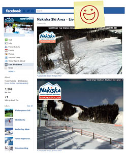 BEST USE OF WEBCAMS: NAKISKA
What’s one of the top pages people visit on a resort website? The webcam pages. So, Nakiska knew it would have a hit by adding these to its Facebook page. Live images are the next best thing to being there. Kudos for not only getting the web cams to fit correctly within Facebook’s parameters, but also for including some basic details of the views.—S.R.
BIGGEST VIRAL HIT: WHISTLER BLACKCOMB
A perennial chart-topper, Whistler’s biggest win this year was in the digital sphere, with its “Shit Skiers Say” viral video hit. The resort was fast off the mark with this one, posting the video soon after the originator, “Shit Girls Say,” went berserk. The video was spot-on, and led the massive pack of memes that were soon to follow. The resort was, however, criticized for its focus only on skiers in the video, a move many in the snowboard community saw as biased.—K.B.
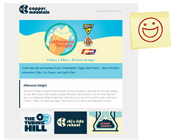 MOST TIMELY E-MAIL: COPPER MOUNTAIN
While traffic is backed up on I-70 as Denver skiers make their way back home, Copper Mountain is starting to reach out to this often-frustrated crowd before they ever hit the stop-and-go. On busy days, Copper automatically creates a list of people that are on the mountain by looking at the resort’s database for passes that have been scanned that morning. The resort then sends these visitors an e-mail containing on-mountain dining offers and, more importantly, an offer encouraging them to grab a discounted hotel room and ski the next day. The first round of e-mails gained 50-percent-plus open rates, nearly triple the industry average for e-mail messaging. I can only imagine what those stats will look like once they go through a few rounds of subject line and copy testing. –G.B.
 MOST OPPORTUNISTIC E-MAIL: BIG SKY
As Colorado and Tahoe resorts missed storm after storm, Big Sky, Montana, capitalized with a simple, straightforward offer: book lodging and ski free with an EpicPass. With the help of a depressingly snow-starved picture from Vail’s Back Bowls, the promotion instantly spread through the industry and was picked up by dozens of ski and news organizations. This one, short press release scored 50+ new reservations. But the deeper value came in how many people that didn’t have an EpicPass heard about Big Sky. While Vail tried to capitalize as well by highlighting this additional benefit of the EpicPass, the fact that the media were putting these two resorts in the same sentence, and declaring Big Sky the better choice, was priceless.—G.B.
 MOST TARDY PR: LAS VEGAS SKI & SNOWBOARD
In 2010, Loveland marketing director John Sellers said the PR the area receives when it is the first resort to open is in excess of $1,000,000. Pop quiz: what was the first resort to open in North America last season? Wolf Creek, Colorado, right? Wrong. It was actually Las Vegas Ski & Snowboard Resort (LVSSR). A cold snap let the resort blow a huge amount of snow, but after making the decision to open on Friday (around the same time Wolf Creek’s announcement came), LVSSR didn’t break the news until after its lifts were turning. Meanwhile, Wolf Creek was basking in coverage from ESPN, Huffington Post, Chicago Tribune, Denver Post, Transworld Snowboarding, The Ski Channel, and dozens of other sources. The fear of making an announcement and then not opening meant LVSSR missed out on a volume of PR that a ski resort of its size could never buy.—G.B.
SOCIAL MEDIA
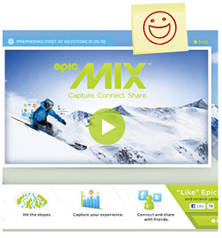 BEST SOCIAL MEDIA INTEGRATION: VAIL RESORTS
Vail Resorts’ free Epic Mix app makes it easy to track your vertical feet, connect with friends and share photos. This year, Vail Resorts positioned photographers on the mountain in bright green jackets to greatly increase the flow of photos being shared online. Guests can easily connect with friends while still on the mountain. The sharing is almost too easy; hopefully, once the novelty wears off, Epic Mixers will be more selective as to what they share.—M.R.
 WORST CONTEST: VAIL RESORTS
What would you pay for a bunch of crappy videos about your new app? Last summer, possibly in an effort to build some buzz leading up to last fall’s Epic Mix Photo announcement, Vail Resorts put on a contest with a $10,000 cash prize for the best Epic Mix video ad. The promotion of the contest was poor, few people participated, and the 10 finalists were shockingly bad. But, true to its word, Vail followed through, paying the $10,000 prize to a winner that hardly deserved any sort of award.—G.B.
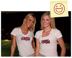 BEST REBRANDING: HEAVENLY
While many areas are chasing families, Heavenly sought to recapture young males—who increasingly prefer the North Shore. To reposition Heavenly as a cutting-edge club scene and entertainment venue with Bay Area mavens, the resort took some key steps. First, it ran a Highway to Heavenly contest: a free weekend trip with a decked-out stretch Range Rover, weekend-long concierge and ski guides, VIP access to South Shore nightlife, and a suite at the Montbleu. To enter, participants followed the @Hwy2Heavenly Twitter handle and subsequent directions. Second, Heavenly partnered with Freeskier Magazine to launch the Search for the Next Heavenly Angel on Facebook. (The winner is also Freeskier’s 2012 “Gear Girl.”) The promotion drove 26,000 visits to the contest tab on Facebook, 243 entries, 7,000 new Facebook fans and 2.7 million impressions among the target via the Freeskier network. —M.R.
 BEST USE OF TWITTER: SUNSHINE VILLAGE
Sunshine got clobbered on Facebook in 2011, so it was heartening to see it learned its lesson well. Sunshine’s “Ski the day before we open” Twitter draw could only be won through participation, and as a result it had a very strong viral component. From moments after the launch until the drawing of the 20 winners’ names, Sunshine was trending in Alberta on Twitter. Sunshine used the promotion to tout the Sunshine-Marmot discount cards, and invited media to join the winners. The end result was a huge jump in Twitter followers, 500 entries, a seven percent increase in Twitter followers and Facebook fans, a great news story for the media pre-season, and 20 advocates who had a fabulous first day. The resort now is among the leaders for both social engagement and growth—that’s quite a turnaround.—M.R.
BEST USE OF TWITTER FOR SNOW REPORTS: SUGARLOAF
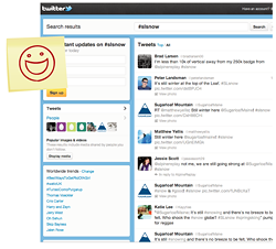 A ski resort that depends on user-generated content to report snow conditions is bold, transparent and understands the power of social media. Sugarloafers were already tweeting about the area; Sugarloaf simply brought them all together. When Sugarloaf redesigned its website in summer 2011, it incorporated social media as a snow reporting tool, enabling skiers and riders to contribute their own thoughts, photos, and videos about what conditions were like. “Using the Twitter API, we incorporated a feed of tweets tagged with #slsnow, which actually appears on our snow report page,” Sugarloaf’s Ethan Austin says. Once tweets with descriptions and photos of snow conditions began to populate the feed, more and more people chimed in, and @SugarloafMaine followers jumped from 4,197 to 6,915.—M.R.
BEST USE OF KLOUT PERKS: ASPEN
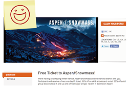 You could ski for free at Aspen/Snowmass this season if you had Klout. Klout positions itself as the standard of influence online by measuring how influential your brand is, based on your Facebook, Twitter, LinkedIn, Google+ and Foursquare networks and engagement. Aspen/Snowmass partnered with Klout to give away free tickets to people with the most influence. Individuals with a Klout score of 40 or higher could receive a free lift ticket, 35 percent off the price of ski and snowboard rentals, 30 percent off adult group lessons, and a free burger. This was a great way to generate buzz among people who share lots of content via their online networks.—M.R.
BEST COVER PAGE: KEYSTONE
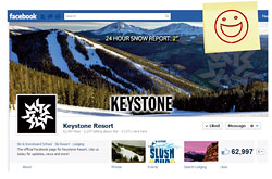 Copper Mountain, Jackson Hole, and Keystone all made their new Timeline Covers visually appealing, but also added relevant and timely information without crossing Facebook policy guidelines. But for pure simplicity, Keystone was my favorite. By adding recent snowfall to its selected image, the site tells fans immediately that “we have new snow,” and second, that “we are so active on this page that we can update our cover image daily.”—S.R.
WORST COVER PAGE: SLEEPING GIANT
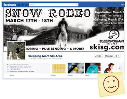
The new Timeline brand page cover is a new frontier. However, a few rules still do apply. First, check that the image is sized correctly at 851 x 315, so it fits and content isn’t cut off. Second, if the event has ended, make sure to remove the outdated info (this was still showing a few days afterward). Third, Facebook has made it clear that including any contact information or calls to action are against their policies.—S.R.
SECOND-WORST EXECUTION: MOUNTAIN HIGH
 When you first go to its page, you are greeted by a welcoming and simple call to action message. The only issue is, after you become a fan, there are no directions that describe how to enter the contest to
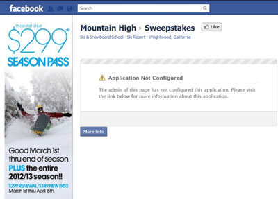 win, and the Sweepstakes page is broken. Mountain High did a good job of planting the idea, but failed on the delivery.—S.R.
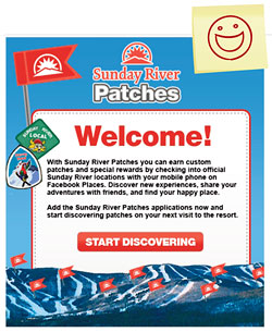 BEST USE OF PATCHES: SUNDAY RIVER
Just posting on the wall is not enough to keep people coming back to your Facebook page day after day. Sunday River took an old idea, “patches,” and turned them into something new, social, and rewarding. This grassroots program took a lesson from Foursquare badges and check-ins, yet used what Facebook had to offer.—S.R.
WORST LUCK WITH A PARTNER: WACHUSETT MOUNTAIN
 Here’s an example that shows that even if you do everything right, the companies you partner with may not. Wachusett definitely delivers with its profile image and the idea of being able to order photo
 prints from its Facebook site. The only issue is that the images never appeared, even after waiting 10 minutes.—S.R.
EASIEST-TO-READ SNOW REPORTS: HEAVENLY

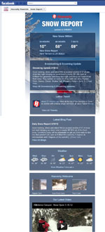 Although quite a few ski areas highlight their snow reports and daily conditions on Facebook, Heavenly does the best job of making the report easy to read, with tidbits of the most relevant information—from new snow to grooming updates, latest tweets, latest blog, weather, latest video, and live webcams.–S.R.
BEST BRAND EXPERIENCE: BRECKENRIDGE

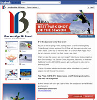 Contests are very popular on Facebook. But Breck went the next step and created a total brand experience in the new Timeline design. That included using the entire page and highlighting other app pages. This was a great way to create relevant pages that help define who Breck is and how it wants to engage with Fans.—S.R.
WORST FACEBOOK CONTESTS
 As natural Facebook fan growth began to slow in the summer of 2011, many resorts turned to contests in order to drive their fan counts higher and higher. Too many to name, these resorts gave away anything and everything, from beanies to mugs to lift tickets, right on their Facebook walls, with “like this” or “best comment wins” contests. These resorts missed out on the chance to capture an e-mail address with a contest app tab, blatantly broke two or three of Facebook’s basic promotional guidelines and, along the way, trained their fans to expect freebies from the resort, not deals or reasons to buy.—G.B.
WORST FACEBOOK TIMELINE GOOFS
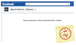 If the goal is to create sticky content that encourages repeat traffic and builds brand loyalty, then many resort Facebook pages missed the mark. With the major platform changes at the beginning of this year, broken pages were rampant. Which is why it is critical to review your content often, or end up looking like, well, Big Rock Ski Resort (welcome page empty); Buena Vista Ski Area (empty shopping page); Big White (completely empty newsroom); or Steamboat (dining page that was empty except for a message directed at the absent page administrator).—S.R.
MISCELLANY
BEST GOOGLE+ EARLY ADOPTERS: COLORADO
 Since Google+ only really became available at the end of 2011, I give credit to the early adopters that took on the challenge of yet another social media property. Interestingly enough, the top Google+ ski resort pages are all in Colorado: Copper Mountain, Keystone, and Breckenridge. They post mostly images and video, event info, and take the time to develop their circles. Most areas have just started their pages and have a few hundred circles, but the Colorado resorts are building their pages faster—they have at least 1000 +1’s.—S.R.
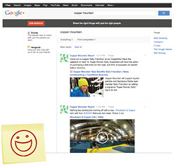
BEST GOOGLE+ EXECUTION: COPPER MOUNTAIN
Besides posting to its page, Copper made sure to take advantage of all that this channel has to offer. Tagline? Check. Upload great photos? Check. Added Google+ page to website? Check. And it is working! The area gathered four-figure followers in just a few months. Plus, it received a boost to its Google search results.—S.R.
WORST USE OF TIRED TRENDS: BRECKENRIDGE
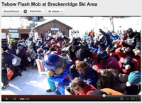
 In the high country of Colorado, while the Denver Broncos’ improbable streak of comebacks continued, resorts began attempting to capitalize on Tebow mania. Perhaps inspired by Loveland’s success (Loveland got footage broadcast during a nationally televised game of Bronco-gear clad skiers taking turns), Breckenridge tried to capitalize by combining two already over-used social trends: Tebow-ing and flash mobs. After an announcement of the event on their social media sites, the backlash from their fans was swift and harsh with responses like, “?Tebowing is an insult to everyone's intelligence...this is appalling” and “never coming to Breck ever again.” –G.B
BEST ONLINE TICKET PROGRAM: CRYSTAL MOUNTAIN, MICH.
 Last summer, Crystal’s sales team decided to emphasize advance lift ticket purchases for the upcoming season. That led to an entirely new approach to everything from window pricing to channel distribution. Liftopia Cloud Store turned out to be an excellent partner. Liftopia helped the resort understand the transaction-side and provided guidance to drive volume. Their platform permitted Crystal Mountain to control both rate and quantity on a daily basis, enabling a finely-tuned yield management strategy for online sales. The gambit increased average ticket yield and provided a savvy audience the opportunity and motivation to make value-enhanced lift ticket purchases online. –M.R.

BEST PASS SALES PROGRAM: GROUSE MOUNTAIN
If an opportunity presents itself to convert fans to customers, do it. And that’s what Grouse did: it made it easy for fans to see and buy season passes by providing the program details, benefits, and the link to purchase.—S.R.BEST SUMMER PROMOTION: TELLURIDE
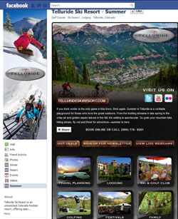
 We all know that fans flock to Facebook during the cold weather, but just because winter may end, Facebook doesn’t. So, why not create a page reminding fans about what’s available in the summer? Telluride created the right message (don’t forget we have things to do in the summer), tailored to the right market (current active fans), at the right time (before they move on to other activities). –S.R.
BEST URBAN ADVERTISING:
TOURISM ALBERTA
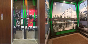
 Travel Alberta is an innovative marketer and this year really hit one out of the park with its “urban gondola” media strategy. The tourism promoter’s “Remember to Breathe” campaign saw the interiors of elevators in several Calgary office towers – as well as some in Fashion Island Mall in Orange County, California – wrapped in vinyl to look like gondola cars, giving the rider the distinct sensation of being at a ski hill on their way to the 21st floor.—K.B.

BEST ON-SITE COMMUNICATION: SQUAW VALLEY
Part of Squaw Valley’s $50 million Renaissance improvement project are their new information systems improving Squaw’s ability to create richer and more interactive relationships with customers on the mountain. Squaw can now instantaneously communicate up-to-the-minute lift status, snow/weather information, and a variety of promotions, along with info on sister resort Alpine Meadows’ conditions, lift status and snow/weather to on-site guests as well as promote products/services via 30 to 40 informational boards throughout the resort. Push notification allowed Squaw to send timely and relevant messages and offers to help guests maximize their experience. —M.R. (Full disclosure: Squaw Valley is a social media partner of Out&About Marketing)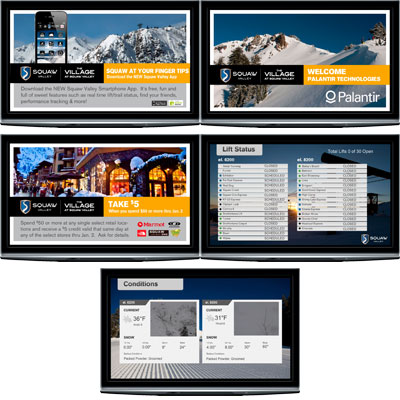
MOST BLATANT RIP-OFF: BRIGHTON
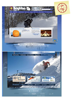 As redesigned resort websites started popping up in fall of 2011, Brighton’s new ’do looked vaguely familiar. An overlay of a Squaw.com screenshot showed the design, layout, and sizing had been blatantly ripped off. On further investigation, Joe Myers, the designer of Squaw’s site, actually found chunks of his text styling work in the website’s HTML code, even though the “new design” didn’t use those same fonts. The company behind the debacle, Infobytes of Salt Lake City, tried to play dumb but eventually fessed up and redesigned the site. The blame wasn’t on Brighton, but it was shocking to think a designer could get away with such a clear ripoff in a community as tight-knit as the ski industry.—G.B.
We admit it, we have a bias toward powerful images when it comes to print advertising. We also applaud clever copy that both engages the reader and communicates precisely what defines a particular resort, especially if that copy is short. But, not when it makes no sense...
BEST BRAND MAKEOVER: MARBLE MOUNTAIN
 This is one of Canada’s unexpected tourism attractions, a bona-fide mountain resort in Newfoundland, an island known more for fishing and hiking than skiing and snowboarding. Traditionally, this resort’s advertising has promoted its down-homey vibe, but this year, it upgraded with a nice-looking and eye-catching print campaign featuring only a tube of generic muscle rub and the tagline “Wait less. Ski more.” It added some cute branded creative on its Facebook page. The campaign dovetailed nicely with the province’s often-lauded tourism marketing efforts, which this winter promoted its abundance of snow-based activities with a series of online videos.—K.B.
BEST MULTI-MOUNTAIN CAMPAIGN: MONARCH
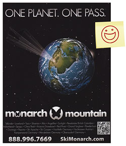 Like it or hate it, Monarch’s “One Planet. One Pass.” ad stands out. In a good way, I think. The more I pored over the magazines, the more I liked it. Monarch’s 28-partner season’s pass program has inspired a ton of imitators, too. That’s a sign of success. And yes, Monarch’s pass sales have risen every year as the area has increased its number of partners, which now span four countries and two continents. Partners benefit too; one of the European areas sold 50 tickets to Monarch passholders. With more than four times the number of resorts available than on the Epic Pass, at roughly half the price, mighty Monarch has really stretched its little wings.—R.K.
BEST BRANDING: ASPEN
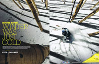
 The “Before Aspen” campaign can be hit or miss for my taste. But two of the images hit the bull’s-eye: unique-town, and skiing the aspens (“Before Aspen, winter was just cold”). Both had an energy and immediacy and novelty that backed up the “only in Aspen” claim. It’s a simple but powerful notion, and these ads tapped it.—R.K.
WORST BRANDING: KILLINGTON
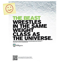
No question, “The Beast” is back. But proving that takes more than bold type against a close-up of snow, especially in a year when fluffy natural snow is as rare as a powder day in August. “The Beast wrestles in the same weight class as the universe”? I can’t imagine what that comparison is supposed to evoke. Cold, dark matter? This campaign has vague echoes of the Foster’s beer ads, in which Foster’s is the synonym for larger-than-life overstatement. But it’s lacking Foster’s funky, in-your-face smack, with the exception of the very direct “North. South. West. Beast.” You’ve got some of the meanest bumps and hellacious night life. Wispy snowflakes? Not very Beast-like.—R.K.
BEST AD MARKET RESEARCH: TELLURIDE
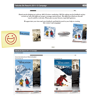 So much of marketing is putting your intuition out there, getting as much data as you can to see how it performed, tweaking, and repeating the process. With print ads, this cycle is slow and extremely expensive. What Telluride did with its pre-season print ad survey—asking existing customers to vote on and choose their favorite ad creative—was a genius move. It gave the Telluride marketing team priceless feedback on print media from the people that were already sold on the product, their own skiers, before a single idea ever went to print. Plus, this approach gave the resort’s skiers a feeling of ownership of the mountain and marketing while providing Telluride an extra level of confidence when it wrote a check to Skiing Magazine last fall. – G.B.
BEST GROOMER/ADVENTURE MIX: SQUAW VALLEY/ALPINE MEADOWS
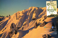
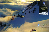 As we said earlier, images of superb grooming were everywhere this season. Alta’s “Aged to Perfection” ad, with echoes of its 1940s roots, was clever. But the dual-spread Squaw/Alpine Meadows package in Mountain captured the best of both worlds: a Squaw groomer finishing up a night’s work at daybreak, followed by a late afternoon backcountry image at Alpine, basked in alpenglow. On one ticket no less. The four pages made it all look luscious, even if the lift passes hanging in the upper right corner were a pedestrian distraction. The overall impression was “wow!” If only the snowfall had measured up before mid-March.—R.K.
WORST VISUAL EFFECT: MT. BACHELOR
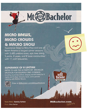 The “Micro Brews, Micro Crowds & Macro Snow” ad shows none of those things—just an odd photo-illustration that disconnects a truly epic air from its roots. I’m not sure it helps to add a psychedelic wave and seagulls to this big-mountain scene, as it contradicts the statement of the mtbachelor.com “naturally” logo buried in the corner. Oh, and there’s too much type, and it’s distractingly difficult to read.—R.K.
THE "PLEASE, PLEASE, PLEASE CHANGE YOUR CREATIVE" AWARD

 Goes to Ski Big Three for its “Real” campaign, which is tired, lame, boring and out of date. Travel Alberta should make them get a new campaign before committing any more co-marketing dollars. —K.B.
THE “I CAN’T BELIEVE NO ONE HAS DONE THIS BEFORE” AWARD
 Male-targeted skincare brand Axe launched a campaign this winter targeting skiers and snowboarders with on-lift safety-bar ads. Nothing new about that, but the brand also cheekily sponsored a bra-and-panty tree at Mt. Norquay in Alberta, asking guests to “Please feed the bra tree” via signage posted underneath it. Now this is a brand that knows its target demo. —K.B.
CLOSE BUT NO CIGAR—BRANDING: JACKSON HOLE
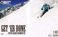
 Love the image; all that pristine pow speaks volumes. This is wide-open charging territory. And with the Rendezvous’ cliffs and iconic tram in the background, we know where we are. But Larry the Cable Guy is not Jackson, and using his “get ’er done” doesn’t do the job here. The adventure looks eminently doable, but it’s an adventure, not a chore. The message is a bit mixed.—R.K.
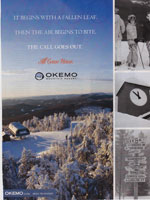 CLOSE BUT NO CIGAR—MOUNTAIN MOOD EAST: OKEMO
 Okemo aimed to capture the spirit of Alpine skiing, as former Killington marketing guru Foster Chandler used to call it. Images of a top lift terminal, with the Green Mountains rolling away into the early-morning sun, were extremely inviting. But the copy, “All come home,” doesn’t quite capture the feeling visiting urbanites have at that sight. It’s more a feeling of “escape the ratrace.” The ratrace is home. Okemo is the escape.—R.K.
CLOSE BUT NO CIGAR—MOUNTAIN MOOD WEST: CRESTED BUTTE
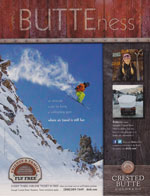
 I really wanted to like the “Butteness” campaign. CB retains a raw-edged, end-of-the-road vibe. It’s rugged and authentic in a way that Vail, and even present-day Aspen, can only dream of. Butteness promises to tell us what that old-west spirit is all about. But the copy writers don’t know themselves. Perhaps it is “hard to define,” as the ad says. But try, at least. You could have asked a bunch of the hardcore ski-bums who work in town. Sort of like Telluride did.—R.K.
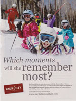 CLOSE BUT NO CIGAR—CUTENESS: PARK CITY
 The question, “Which moments will she remember most?” is exactly why so many parents introduce their kids to skiing and riding. But the out-of-focus images of her smiling while standing in ski class aren’t it. She’ll remember her first mogul run, or rail slide, or scoot through the trees, or face shots in six inches of freshies.—R.K.
MOST CLEVER USE OF BATHROOM HUMOR: BLACK DIAMOND

 Black Diamond’s Avalung ad might be not just clever, but extremely well-timed, given the number of avalanche deaths this past season. The ad’s black humor strikes a cautionary tone without being shrill or morbid.—R.K.
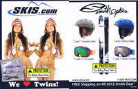 WORST USE OF SEX: SKIS.COM/SMITH
 Skis.com and Smith teamed up for a cheesy double-entendre involving twin girls and twintip skis. Given the possibilities, we can at least be thankful the two brands didn’t carry their fun any further. As it is, they went too far.—R.K.
MOST DISAPPOINTING CANADIAN COMPANY:RCR
 Resorts of the Canadian Rockies (RCR) had a bit of a strange presence in this year’s SBC Ski & Snowboard Resort Guide, a national consumer magazine showcasing Canada’s mountain resorts. Its first double-page spread was a co-branded effort with Helly Hansen, promoting a partnership for RCR staff outerwear, which is a strange focus for a consumer mag. Then it bought two more pages, one for Fernie in B.C. and the other for Kimberly, also in B.C. The former was an old-fashioned family-photos-and-accomm- prices creative effort; the latter was marginally better but still standard-issue.—K.B.


