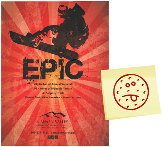
In Jay Peak Magazine, Jay Peak and the Origin design team create top-notch coffee table content. But instead of showering them with (well-earned) praise for their edginess or candor, this team deserves a lifetime achievement award for the simple feat of delivering its deep, delicious product on time, if not early. Thousands of winter and summer magazines are shipped and placed at least three months before the start of whichever season the resort is promoting, without fail. If you’re going to sink your resources into making a magazine, give it six months of effective deployment like Jay Peak does. Easy to say, but very few pull it off. —AK

Best Use of Direct Mail: Jay Peak, Vt.

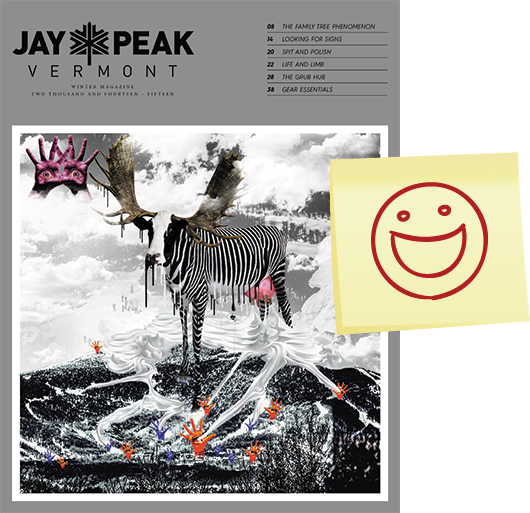
In today’s plugged-in society, Jay Peak’s unconventional “Mind Your Moments” campaign inspired guests to live in the now by showing images of people doing the exact opposite, via a direct mail piece that provided incentives for people to sign up for a vacation. The piece successfully integrated with other print/digital components, including myriad pages of branded content in Jay Peak’s magazines, “how-to-plan-your-trip” emails sent promptly after a trip was booked, and a follow-up feedback email program—propelled by “Frank the Cowbramoose,” a recognizable character that tied the campaign together over various channels. Integrating a DM piece with a digital component gives it life and makes it more powerful. Clearly, Jay Peak inspired people to act, rather than having to sell them on the idea.—MR

Worst Branding: Canaan Valley, W.Va.
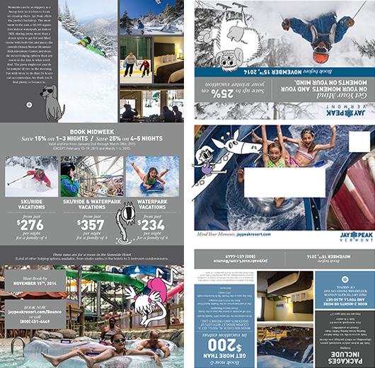
Epic? Not exactly. This ad looks like someone searched “snowboarder graphic” on Google Images, picked a random stock silhouette, then pasted it onto a sunburst page with some text. A basic principle in advertising: know your audience. If you buy an ad in a snowboard publication, consult some snowboarders, or, hell, put one in charge of it before it goes to print. Talk to the park manager, the park rats, the local snowboard shop dudes—take their advice. And for Pete’s sake, read a snowboard magazine. A little effort goes a long way.—MG
A similar ad in Powder was no better. —Ed.

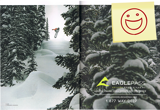
Best Dream Scene: Eagle Pass, B.C.
Though heliskiing may not be a realistic goal for everyone, everyone is welcome to dream about it, and this ad helps that along. Beautifully laid out and impressively shot, it features legendary pro rider DCP (David Carrier-Porcheron), and truly sets Eagle Pass apart from other destination resorts visually. Chadwick Chomlack’s photo draws the viewer into a zone you can only reach by helicopter in Revelstoke, and the line you’re looking at is absolutely epic. This ad displays exactly what a place like Eagle Pass brings to the table: exclusive, perfect terrain; eye-popping scenery; and pristine, abundant powder. —MG

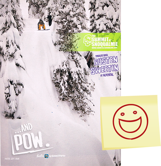
Best Picture Worth 1,000 Words: Summit at Snoqualmie, Wash.
Most people flipping through a snowboard magazine are just looking at the photos. If you can get your hands on one that was shot at your resort and looks like it belongs in a magazine, you should run with it, like Summit at Snoqualmie did here. You have a really sweet looking pow ledge and lots of deep, fresh snow with professional snowboarder Austen Sweetin dropping in. All the important aspects of a good shot are present, which makes for a good full-page photo and a great advertisement overall. What better way to get someone to look at your ad then to give them what they wanted to see in the first place?—MG

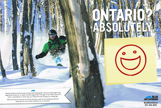
Best Pitch for Staying Close to Home: Blue Mountain, B.C.
Blue Mountain’s Ontario? Absolutely advertisement in SBC Ski and Snowboard Resort Guide shows a dirtbag skier—complete with snot encrusted beard and fat skis—bashing through some tight timber that might be mistaken for another resort, perhaps Steamboat or one in the Eastern Townships. The copy exhorts flatlanders (Blue Mountain only has a modest 732 vertical feet) to claim that “10 cm (just under four inches) of fresh is considered a ‘pow day’, so you make the most of every run, every day.” This ad helps convince core skiers they can have a great time close to home.—ST

Most Resourceful Way to Write History: Bolton Valley, Vt.
Have one or two talented seasonal marketing employees that could perhaps use a bit more challenge? If so, perhaps have them learn and write the history of your ski area. When Bolton Valley’s local newspaper, the Burlington Free Press, approached the resort about telling the story of the ski area, the task was assigned to their seasonal communications guy. Now Bolton Valley has a solid start to a finished piece on the resort, which can be easily cropped into smaller content nuggets, as well as a coordinator that’s far more equipped to represent the ski area.—AK


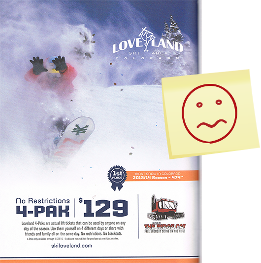
Most Ho-Hum Image: Loveland, Colo.
This ad contains the perfect amount of information. Loveland’s awesome “No Restrictions 4-pak” pass is boldly displayed. A blue ribbon banner showing the first place award for most snow in Colorado 2014, along with the “free snowcat skiing” graphic exemplify great use of exciting, informative, and easy-to-read copy. However, the text pieces are laid over a just-okay photo of a boarder emerging through a cloud of snow, a shot that isn’t quite explicit enough to rouse my excitement. Like I said, people are reading these mags for the photos to begin with, so throw in a better shot, and you’ve got a nearly perfect ad.—MG

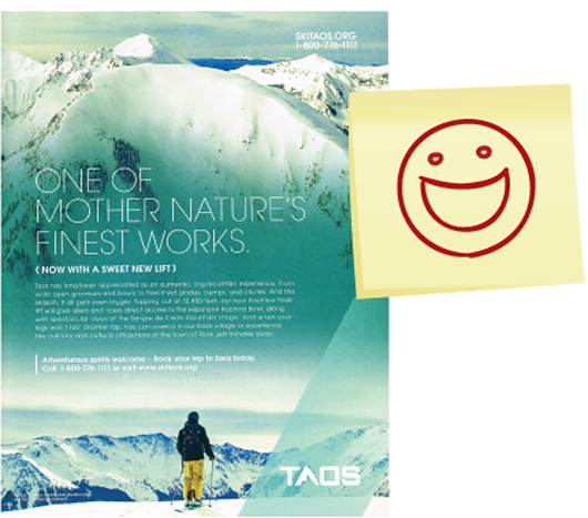
Best Use of Photoshop: Taos, N.M.
Taos’ manipulated snowscape images in its 2013-14 campaign were intriguing, but ultimately distracting and failed to inspire. They felt cold and uninviting. This year’s dreamlike “One of Mother Nature’s Finest Works,” depicting the now lift-accessed Kachina Peak, succeeds. It’s easy to step into the photo. I want to be there. Prominent phone and online contact points make that easy to arrange. And before I forget, thanks for the lift! —RK

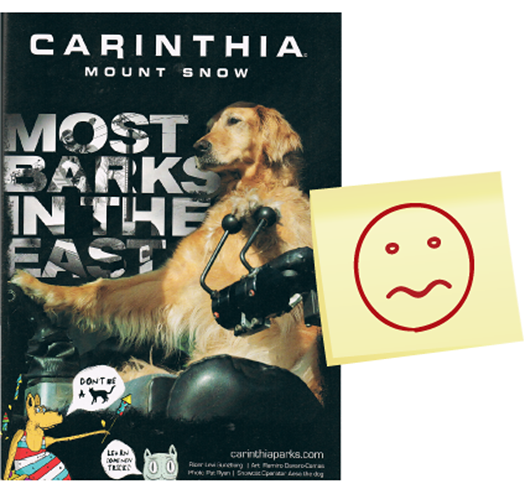
Biggest Underuse of a Good Photo: Mount Snow, Vt.
This year’s Carinthia Parks ad for Mount Snow features a golden retriever concentrating on piloting a snowcat, an entertaining concept followed through with solid execution and a funny play on the slogan “Most barks in the east.” The ad’s good for a laugh, but remember, the goal is to convince people to check out Mount Snow. The snowboarding photo that’s featured in the ad is tough to make out because it’s superimposed over the text. This ad would be great if that photo was easier to see. Everyone wants an idea of what they can expect at your resort, and some may need a clearer image to push them to check it out. —MG

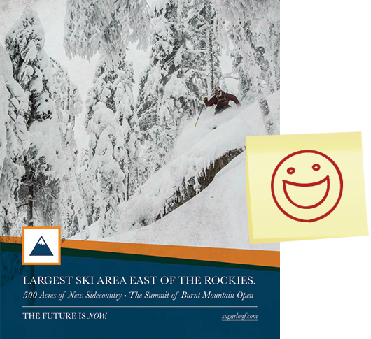
Best National Ad for an East Coast Resort: Sugarloaf, Maine
Not many Eastern resorts choose to place national print ads. In a late-season edition of Powder there was a total of one: Sugarloaf. If a single Eastern resort is going to put marketing dollars into national advertising, it makes sense that it’s a “bucket list”-type place that many have yet to visit. I’ll leave design debate to the professionals, but Sugarloaf’s ad makes the snow look western-destination quality. The copy reminds us why it should be on the bucket list. I imagine it was difficult to not use an OMG shot of the triangle-shaped behemoth, but this hat tip was really about the bold and valid choice to advertise at all, not a comment on the choice of image.—AK

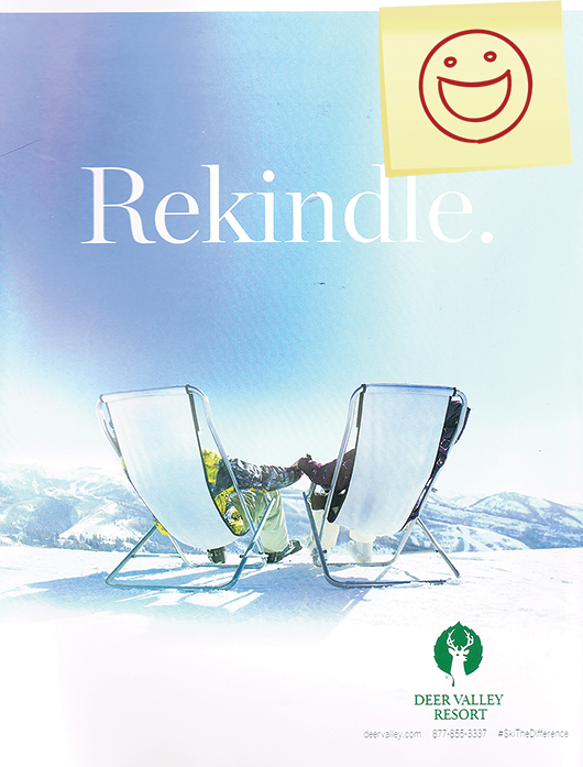
Best Return to Form: Deer Valley, Utah
Deer Valley has consistently positioned itself as a place for R&R with family. Its simple, austere ads have been clever and bold. Last year’s concept, I felt, was a bit of a stumble. This year, DV got back in step. The one-word branding pieces—“Reconnect,” “Regroup”—are all good, but “Rekindle” especially so. Deer Valley knows what makes it special to its guests. Not sure that the visual nod to the Cialis “his and her tubs” is intentional, but it can’t hurt. —RK

Best Use of Sarcasm: Red Mountain, B.C.
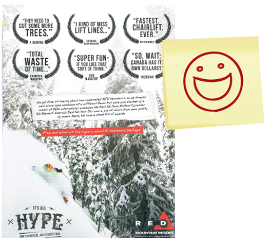
Red Mountain’s “It’s All Hype” campaign took aim at the fact that Red is often referred to as North America’s most underrated resort. The ad featured a series of fake quotes—“I kind of miss lift lines”—Colorado Skier Magazine, and “Total Waste of Time”—Hardpack Magazine—while showing a photo of a local shredding pow in Red’s steep tree chutes, “the coolers” to locals. Red—which has garnered considerable press since new owner Howard Katkov took over—cheekily warns its readers, “Don’t Believe Us … Just Believe Them.” —ST

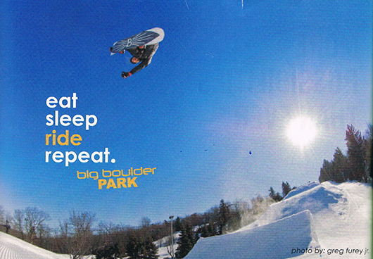
Worst Pixel Problem: Big Boulder, Pa.

Why would you want to put a blurry, pixilated photo of your facilities in a magazine ad—especially one that you paid for? Given the clarity of the text over the picture, it’s apparent that whoever made the ad knew the photo was soft and chose to use it anyway. Greg Furey is a well-known snowboard photographer. By not using the proper size and resolution for his image, which I’m sure he would have provided upon request, the ad reflects poorly on him as well as the resort. None of the other photos or ads in these mags look this poor—try not to stand out for the wrong reasons.—MG

Best Attention-Grabbing Headline: Mountain High, Calif.
This ad is a perfect example of a campaign that successfully integrates online content and social media, and encourages readers to take a more in-depth look at the resort via these channels. In the fine print under the headline "Have You Seen Him?" ("him" being the rare Sierra yeti) the ad presents an opportunity to "WIN an Anytime Season Pass" written in bold to grab attention. And that entices readers to focus on what else the ad has to say. I can't think of anyone who wouldn't go out of their way for a free season pass, and running a photo contest via Facebook, Twitter, and Instagram is a great way to get customers to participate in the campaign by doing something they enjoy.—MG


Close But No Cigar Award: Crested Butte, Colo.
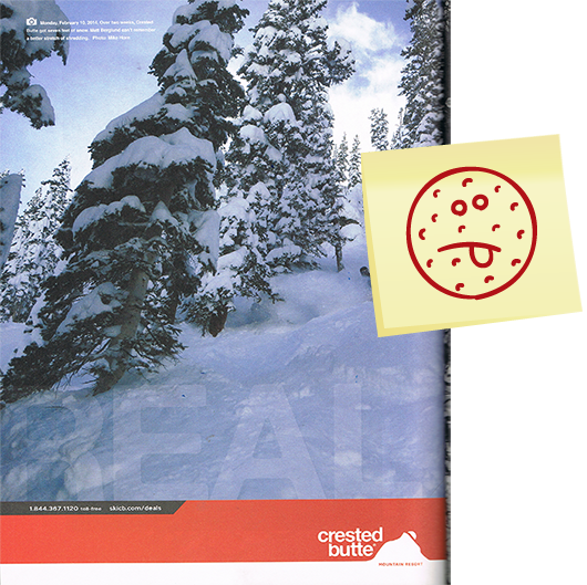
Crested Butte received seven feet of snow over just two weeks this winter, according to the caption in this photo. That’s a pretty awesome stat, and the photo isn’t half bad, either. But overall, the ad doesn’t quite cut it. You can see there’s an abundance of snow; however, the photo is not very clear, and the snowboarder is dark and out of focus. Also, the seven-feet-in-two-weeks thing was underplayed by being buried in the caption when, by all means, it’s something to shout about.—MG

Worst Timing: Mount Washington, B.C.
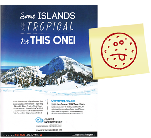
Mount Washington, located on the Vancouver Island Ranges of British Columbia, tempted fate this winter when it ran a print ad with the copy, “Some Islands Are Tropical… not THIS ONE.” Of course, one should never tempt the weather Gods, and this winter, a series of lethal tropical storms descended on the area. Like other coastal B.C. resorts, Washington endured a horrible season—shutting down its lifts on Feb. 9 due to a lack of snow and near-tropical temperatures. —ST

Best use of night photography: Visit Bend, Ore.
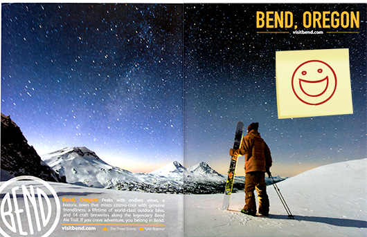
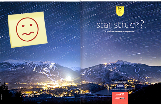
The Mountain bonus gallery issue features two dramatic night-sky spreads separated by just two pages. The juxtaposition is ripe for comparison. The night sky is often a revelation for mountain destination visitors, and these spreads are eye-catching. Still, we’re not sure these images of vastness are the best way to sell a destination; skiing and riding are usually better at that. But of this year’s duo, we prefer Bend; at least the message of massiveness is clear. The Whistler ad copy, “star struck? Clearly we’ve made an impression,” doesn’t immediately connect to the Ski #1 gold-medal badge. The overall message leaves us in the dark just a bit too much.—ST and RK

Best boast: Killington, Vt.
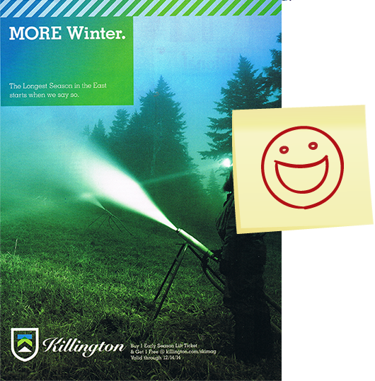
When you’re the “Beast of the East,” you’re confident enough to have a sense of humor about it. In the “More Winter” ad, the claim is simply, “The longest season in the East starts when we say so.” That’s a chest-poundingly bold claim; Mother Nature has the last word, as we all learned this past winter. But even so, Killington has a reputation for making snow as soon as temperatures allow, and not waiting for natural snowfall. For most of the past four decades, the Eastern ski season has begun when Killington says so. And this reminds Eastern skiers of that fact.—RK

Best atmospherics: Steamboat, Colo.

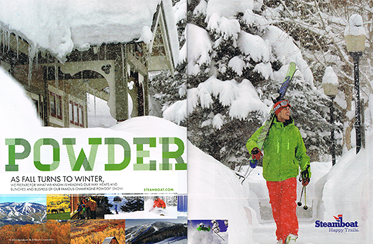
Steamboat’s campaign this year was all about the vacation mood, on and off the mountain. All versions were good; this was our favorite. The spread captures the tingling anticipation we all feel on a powder day. It also reinforces the notion that Steamboat gets a ton of snow, and has one of the best ski towns in the world at its feet. The overall imagery portrays the warmth of winter and the breadth of the Steamboat experience beautifully. As the ad says, “Happy Trails.”—RK
